
Contamination trend dashboards can help you make smarter decisions by using six key metrics that remove guesswork. Focus on contamination frequency, incidence rates, and severity to understand how pollution varies over time. Identifying hotspots and sources allows targeted actions. Visual tools like color coding and interactive filters make data clear and actionable. If you want to master these metrics and optimize your environmental management, keep exploring to uncover how to implement them effectively.
Key Takeaways
- Focus on measurable metrics like contamination levels, detection frequency, and hotspots to ensure accurate trend analysis.
- Use real-time monitoring and automated detection systems for timely data collection and immediate response.
- Align metrics with specific contamination reduction and safety objectives for targeted decision-making.
- Visualize data through dashboards with color coding and filters to quickly identify high-risk areas and trends.
- Regularly analyze incidence rates and spatial patterns to pinpoint sources and prioritize high-risk zones.

AKSTEST HFS-7311 Radiation Detector, High-Sensitivity Radiation Detector for X, Gamma, Alpha, Beta Rays, Real-Time Monitoring, LCD Display, Alarm Alerts, for Labs, Industrial & Personal Safety
High-Sensitivity Radiation Detection – The AKSTEST HFS-7311 is equipped with a high-precision LND7311 mica window sensor, capable of…
As an affiliate, we earn on qualifying purchases.
As an affiliate, we earn on qualifying purchases.
What Are Contamination Trends and Why They Matter
Contamination trends reveal how pollution levels change over time, providing critical insights into environmental health. By tracking these patterns, you can identify contamination sources that consistently contribute to pollution spikes. Understanding trends helps refine risk assessment, allowing you to prioritize areas needing immediate attention. Recognizing fluctuations in contamination levels enables proactive responses, reducing potential health and ecological risks. Trends also illuminate whether current mitigation efforts are effective or if new strategies are necessary. Without this data, you risk making decisions based on guesses rather than facts. Monitoring contamination trends ensures you stay ahead of environmental issues, ultimately protecting public health and preserving ecosystems. Clear, consistent tracking turns complex data into actionable insights that guide smarter environmental management choices. Regular data collection is essential for maintaining accurate and up-to-date contamination trend analyses, and employing advanced analytical tools can enhance the precision of these assessments. Additionally, integrating real-time monitoring systems can provide more immediate responses to emerging pollution concerns. Incorporating automated detection systems can further improve the timeliness and accuracy of contamination data.
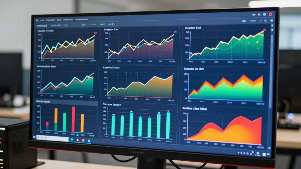
environmental contamination dashboard software
As an affiliate, we earn on qualifying purchases.
As an affiliate, we earn on qualifying purchases.
How to Select Key Contamination Metrics for Your Dashboard
To choose the right contamination metrics, you need to focus on those that truly matter to your goals. Think about what insights will help you make better decisions and improve processes. Make sure your selected metrics align with your overall objectives for effective monitoring. Incorporating accurate measurement tools ensures the reliability of your data and enhances your decision-making capabilities. Additionally, considering specific contamination sources can help target efforts more effectively. Understanding measurement precision is essential for obtaining dependable data that reflects actual contamination levels. Recognizing data variability can further improve the accuracy of your assessments, especially when implementing robust data collection methods to minimize inconsistencies.
Identifying Critical Metrics
Selecting the right contamination metrics is essential for creating an effective dashboard that accurately reflects your contamination risks. Focus on metrics that directly impact safety, quality, and compliance, such as contamination levels and detection frequency. Ensuring sensor calibration is fundamental because inaccurate sensors can distort data, leading to misguided decisions. Incorporate data integration from multiple sources to get a comprehensive view of contamination trends. Prioritize metrics that are measurable, timely, and actionable, allowing you to respond swiftly to emerging issues. Avoid overwhelming your dashboard with excessive data; instead, select key indicators that highlight critical risks. By honing in on these critical metrics, you’ll make informed decisions that improve safety protocols and maintain product integrity.
Aligning With Objectives
Aligning your contamination metrics with your overall objectives guarantees that your dashboard effectively supports decision-making. To do this, focus on selecting sample metrics that directly reflect vendor performance and contamination trends relevant to your goals. For example, if reducing contamination is a priority, track metrics like contamination rate per vendor and sample positivity rates. Use this table to visualize how different metrics align with your objectives:
| Objective | Sample Metrics |
|---|---|
| Improve vendor quality | Vendor contamination rates |
| Reduce sample rejections | Rejection rates per vendor |
| Enhance testing accuracy | False positive/negative rates |
| Increase detection speed | Turnaround time for contamination results |
| Monitor overall contamination trend | Weekly contamination trend analysis |
This clarity ensures your dashboard emphasizes metrics that matter most, such as the contamination trend, which provides insight into long-term patterns and effectiveness of control measures. Additionally, selecting the right contamination metrics ensures your team can accurately interpret data and take timely action.

Airthings View Pollution – PM2.5 Air Quality Monitor, PM2.5 Sensor, Humidity & Temp – Smart Indoor Air Pollution Detector for City Pollution & Wildfire Smoke Monitoring – App, Battery Powered & WiFi
INDOOR AIR QUALITY MONITOR: Stay in control of your indoor air quality and keep pollution out. This air…
As an affiliate, we earn on qualifying purchases.
As an affiliate, we earn on qualifying purchases.
Monitoring Contamination Frequency and Incidence Rates
Monitoring Contamination Frequency and Incidence Rates. To effectively monitor contamination, you need to track how often contamination occurs over time. Calculating incidence rates helps you understand the likelihood of contamination in different areas. Incidence Rates can also be used to compare contamination levels across various zones and identify patterns. Implementing data collection methods ensures accurate measurement of contamination trends and supports targeted interventions. Accurate data analysis is essential for identifying high-risk zones and developing effective prevention strategies. Identifying high-risk zones allows you to focus your prevention efforts where they’re most needed. Incorporating play-based learning strategies can also help children develop healthy habits and resilience against contamination risks. Understanding contamination sources further enhances your ability to implement precise prevention measures.
Tracking Contamination Frequency
Tracking contamination frequency involves systematically monitoring how often contamination events occur and calculating their incidence rates over time. To do this effectively, you need to:
- Follow consistent sampling protocols to ensure accurate data collection.
- Record contamination events precisely, noting their timing and location.
- Compare contamination levels against established thresholds to identify trends.
- Use this data to pinpoint patterns or spikes that may signal process issues.
- Employ troubleshooting strategies from the guide to interpret warning signs and address potential problems proactively. Additionally, understanding the contamination trends can help inform preventive measures and improve overall safety protocols.
Calculating Incidence Rates
Calculating incidence rates builds on your efforts to monitor contamination frequency by providing a quantitative measure of how often contamination events occur within a specific timeframe. To do this effectively, you need reliable sampling techniques that accurately capture contamination occurrences. Set clear contamination thresholds to determine when a sample indicates a contamination event. By dividing the number of positive samples by the total samples collected over a given period, you obtain the incidence rate, which reflects contamination frequency. This metric helps you identify trends and assess contamination risks over time. Consistent sampling and precise thresholds guarantee your incidence rates are accurate and meaningful, enabling better decision-making and targeted interventions. Incorporating standardized protocols ensures your data remains consistent and comparable across different testing periods. Ultimately, this approach transforms raw data into actionable insights, reducing guesswork in contamination control.
Identifying High-Risk Areas
Identifying high-risk areas is essential for focusing your contamination control efforts where they’re needed most. Monitoring contamination frequency and incidence rates helps you spot hotspots quickly. To do this effectively, consider these steps:
- Analyze data trends to pinpoint persistent contamination zones.
- Measure contamination incidence rates over time for accurate risk assessment.
- Prioritize areas with frequent or severe contamination for targeted preventative measures.
- Engage stakeholders regularly to guarantee all parties understand risks and collaborate on interventions.
- Incorporate contamination metrics from tools like dashboards to enhance your monitoring accuracy.

Detekt #1 Water Test Kit for RV Freshwater Systems Detects Bacteria & Mold in Water System – Ultra-Sensitive Microbial Water Test – Made in USA – 5 Minute Results + Species ID
EASY, FAST, & SIMPLE: Get initial results under 5 minutes and visual growth results in 72 hours.
As an affiliate, we earn on qualifying purchases.
As an affiliate, we earn on qualifying purchases.
Identifying Hotspots and Contamination Sources
To effectively locate contamination hotspots and sources, you need to analyze data patterns across different regions and time periods. Start by examining data collected through various sampling methods to guarantee thorough coverage. Consistent sampling helps identify recurring problem areas and potential contamination origins. Comparing your findings against regulatory standards allows you to determine if contamination levels exceed acceptable limits. Look for clusters of elevated readings and patterns that persist over time. Combining spatial analysis with temporal trends reveals specific locations where contamination concentrates, making it easier to pinpoint sources. Incorporating comprehensive data analysis techniques enhances the accuracy of your detection efforts and helps uncover underlying contamination patterns that might otherwise go unnoticed. Additionally, applying advanced statistical models can improve the reliability of your interpretations. By integrating these insights, you can target interventions more effectively, prioritize areas for investigation, and implement corrective measures promptly. Employing robust data collection methods ensures your detection efforts are data-driven, accurate, and aligned with regulatory requirements.
Tracking Contamination Severity and Impact Over Time
Tracking contamination severity and impact over time requires ongoing monitoring to understand how contamination levels fluctuate and influence environmental and public health. To do this effectively, you should focus on:
- Regular sampling strategies that capture data across different times and locations.
- Comparing results against established contamination thresholds to identify concerning trends.
- Tracking changes in contamination severity to determine if levels are increasing or decreasing.
- Evaluating the impact of contamination on communities and ecosystems over specific periods.
Using Data Visualization to Improve Decision-Making
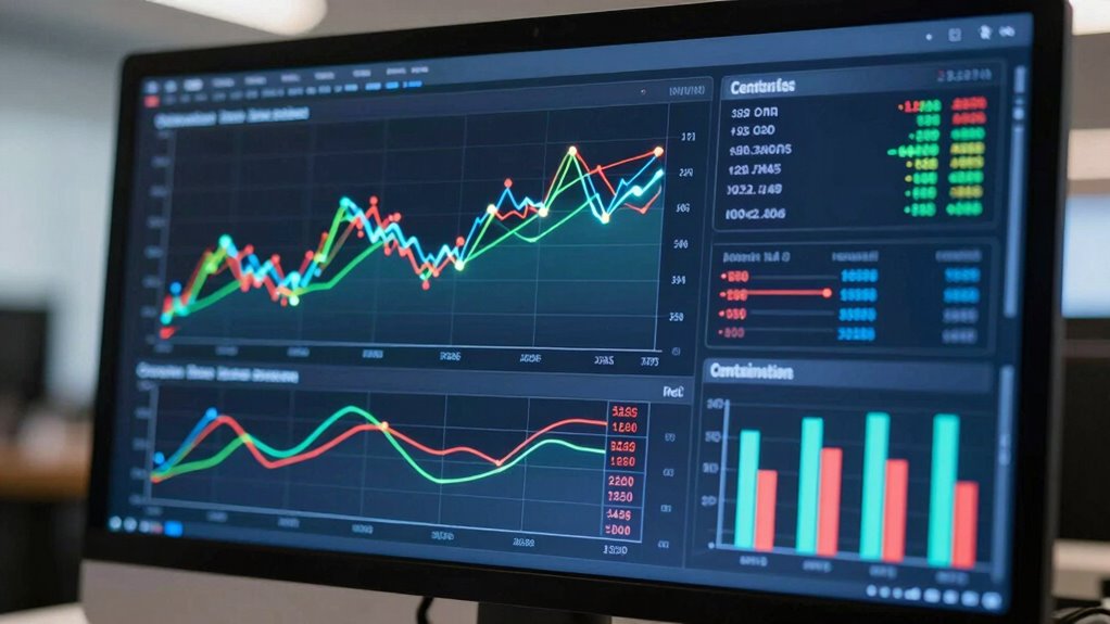
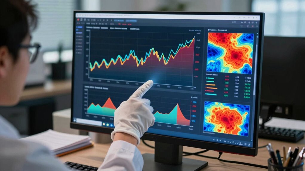
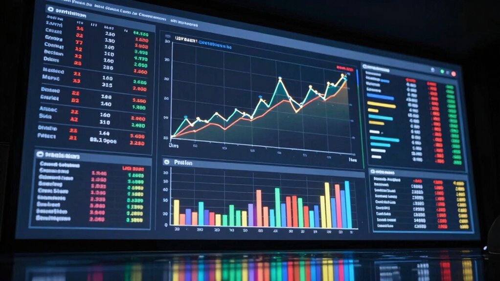
Data visualization transforms complex contamination data into clear, actionable insights that support better decision-making. By using color coding, you can quickly identify contamination levels, hotspots, and trends at a glance. Interactive filters allow you to customize views, focusing on specific time periods, locations, or contamination types, making analysis more precise. These tools help you spot patterns and anomalies without sifting through endless spreadsheets. With visual dashboards, you can communicate findings effectively to stakeholders, fostering informed decisions quickly. The ability to manipulate data visually enhances your understanding, reduces guesswork, and accelerates response strategies. Ultimately, leveraging color coding and interactive filters guarantees your contamination management is proactive, data-driven, and more efficient.
Frequently Asked Questions
How Often Should Contamination Data Be Updated for Effective Dashboards?
You should update contamination data at least daily to guarantee your dashboard provides real-time updates and maintains data accuracy. Frequent updates allow you to catch trends early, respond quickly, and make informed decisions. Depending on your industry and contamination risk level, more frequent updates—like hourly—may be necessary. Consistent, timely data refreshes help you stay ahead of contamination issues and keep your dashboard reliable and effective.
What Are Common Challenges in Implementing Contamination Trend Dashboards?
Ever wondered what hurdles you might face? You’ll often encounter challenges like ensuring data accuracy, which is vital for reliable insights, and enhancing user accessibility so everyone can interpret the dashboard effortlessly. Implementing contamination trend dashboards requires overcoming technical issues, integrating multiple data sources, and training staff. Staying vigilant about data quality and designing user-friendly interfaces helps address these common challenges, making your dashboard a powerful tool rather than a confusing obstacle.
Can Dashboards Predict Future Contamination Outbreaks?
Dashboards alone can’t predict future contamination outbreaks, but they play a crucial role in contamination modeling and outbreak forecasting. You can analyze current data trends, identify early warning signs, and make informed predictions. By integrating real-time data and advanced analytics, you improve your ability to anticipate outbreaks. This proactive approach helps you respond swiftly, reducing risks and safeguarding public health more effectively than guesswork alone.
How to Train Staff to Interpret Contamination Metrics Accurately?
You should focus on hands-on staff training with data visualization tools to help them interpret contamination metrics accurately. For example, simulate real scenarios where staff analyze dashboard data to identify contamination patterns. This practical approach enhances understanding and confidence. Regular workshops and refresher sessions reinforce skills, ensuring your team can make swift, informed decisions based on the metrics, ultimately reducing contamination risks and improving overall safety.
What Software Tools Are Best Suited for Contamination Trend Analysis?
You should consider software tools like Tableau or Power BI for contamination trend analysis. These platforms excel at data visualization, helping you identify contamination sources quickly and accurately. They allow you to create interactive dashboards, making it easier to spot patterns and trends. By integrating your contamination data, you gain clearer insights, enabling proactive measures to reduce contamination risks and improve overall safety.
Conclusion
By focusing on these six key contamination metrics, you’ll turn your dashboard into a powerhouse of insight—no more guessing games. With clear data guiding your decisions, you can identify hotspots faster than ever and prevent outbreaks before they spiral out of control. Think of it as wielding a superhero’s toolkit, transforming chaos into clarity. Master these metrics, and you’ll outsmart contamination like a true health hero—saving your environment and reputation with unmatched precision.